Canadians Makeover
Saturday, January 25 2014 @ 01:52 AM EST
Contributed by: #2JBrumfield
The three-time Northwest League champion Vancouver Canadians will have a different look when they take to the field in 2014.
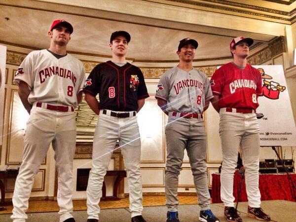
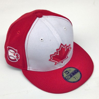
The Canadians - with the help of members from the UBC Thunderbirds baseball club - unveiled their new uniforms during its 4th annual luncheon at the Fairmont Hotel Vancouver. The big changes are a new font, a new Mountie logo on the black jersey and the addition of a uniform number on the front of the jersey. The Blue Jays cap logo is now on the sleeves instead of the circular word logo that was used over the last two seasons. The C's had used the 1977 logo on the sleeves to mark its first year of affiliation with Toronto back in 2011.

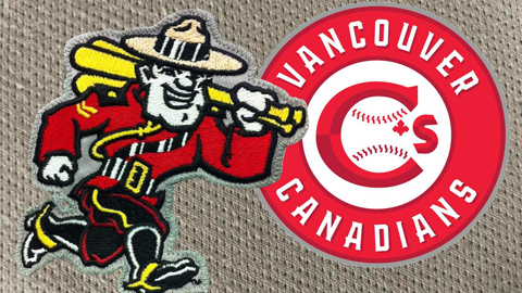
The old logo and the new logos of the Vancouver Canadians.
The C's have tweaked its primary logo with a different font and replaced the apostrophe with a maple leaf. The baseball stitches are more defined and a different bevel is used for the 'C'. An alternate logo of a Mountie has also been introduced, paying homage to the Vancouver Mounties, who played in the Pacific Coast League from 1956-62 and 1965-1969. Famous alumni include Tony La Russa, Brooks Robinson, Jim Bouton and former Blue Jays general manager Pat Gillick.
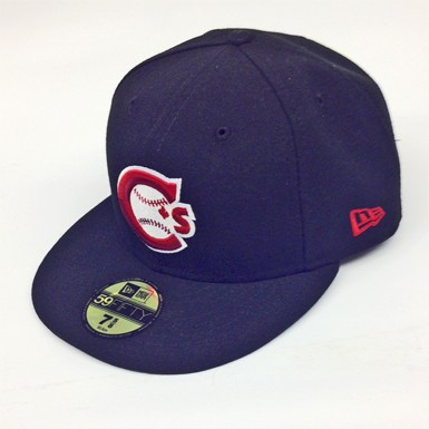
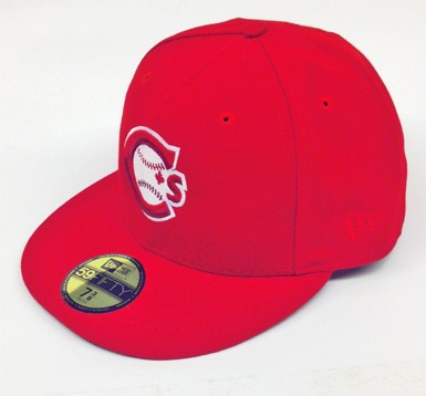
The solid red and black caps for the C's in 2014. The red will be worn at home and the black will be worn on the road.
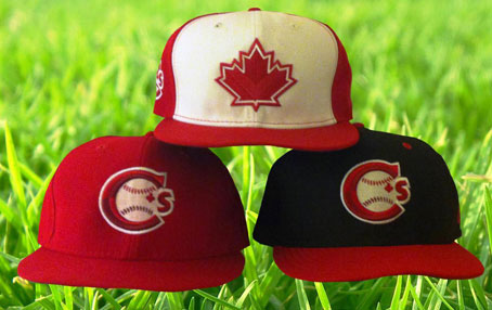
A Canada Day cap and a black cap with a red bill will also be a part of the C's haberdashery in 2014.
On a personal note, I figured the C's were going to change their uniforms after selling off their game worn jerseys worn from the last two seasons during its World Series Party last October for season ticket and "Nat Pack" holders. The new look is nice but I still prefer the jerseys and caps they have worn since my arrival in Vancouver in 2012, especially the lucky black jerseys they rode to their last two league championships.
In other news...
The Vancouver Sun story linked above mentions the C's are looking to add about 500 seats at Nat Bailey Stadium in time for the upcoming season. An earlier Vancouver Sun story reported the new seats would be added along the third base side and above the outfield fence, a la Fenway Park.
On a final note, the C's - winners of the 2013 John H. Johnson President's Trophy as MiLB's top minor league franchise - will be honoured by the Western Hockey League's Vancouver Giants before tonight's game against the Victoria Royals at the Pacific Coliseum. Canadians pitcher and Ladner, B.C. native Tom Robson will be in attendance.
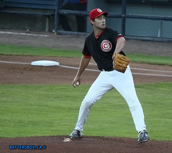
Tom Robson, modelling the lucky - and (sadly!) discontinued - black jersey the C's wore for their last two league titles - was the winning pitcher in Game 3 of the 2013 Northwest League final against Boise. He will be signing autographs during the first intermission of the Vancouver Giants-Victoria Royals WHL game tonight.
6 comments
https://www.battersbox.ca/article.php?story=20140124234628339