Consider this a tack-on to Magpie’s excellent work from last week regarding the how the Blue Jays were historical in terms of their actual record vs. their Pythagorean record. It’s been postulated that part of the reason for this was that they scored a lot of meaningless runs, running up the score in games that were already out of reach. Another popular theory is that Toronto’s long-sequence-low-power offence was more prone to producing very small or very large run totals in any given game. This idea may be fueled (wrongly, in my opinion) by J.P. Ricciardi’s remarks near the end of the season about needing more hitters who could put the ball in the seats.
Anyhow, let’s see how the Blue Jay attack lines up against others that produced a similar number of runs over the season, in terms of number of runs scored in each game. “SD” is the standard deviation from the team’s overall runs per game average. “0-1” is the number of times they scored 0 runs or 1 run; and so forth. “Average” is for these 5 teams only, not all of MLB.
     	HR	R/G	SD	0-1	2-3	4-5	6-7	8+
LA of A	147	4.70	2.99	21	45	42	29	25
Atlanta	184	4.75	2.86	19	37	54	25	27
Oakland	155	4.77	3.45	28	39	37	25	33
Toronto	136	4.78	3.12	21	41	38	32	30
Cleve.	207	4.88	3.22	22	38	41	29	32
Average	166	4.78	3.13	22	40	42	28	29
So, despite hitting the fewest homers of the teams closest to them in terms of total runs scored, the Jays were dead average in terms of highs and lows (as demonstrated by the standard deviation). I’ll leave it to someone with better statistical chops to determine if it’s possible to get a better handle on this by looking at all Major League teams; I would expect that higher-scoring offences would inherently have higher standard deviations, and lower-scoring ones less standard deviation. I’m also guessing that part of the reason Atlanta has the lowest SD in this group is the more common use of one-run strategies in the National League.
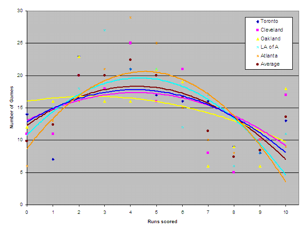
Let’s look at this data in graph form:
That’s a bit of a visual onslaught… Two points of clarification: The lines are 2nd-order polynomial trend lines fit to the data. “10” is actually “10 or more” runs scored. What I find interesting here is how very similar the Toronto and Cleveland offences look, despite Cleveland having launched 70 more home runs, and that Toronto is the closest to the average.
That's all I got. Any more-educated takes on what the data here tells us? On what it doesn't tell us?
https://www.battersbox.ca/article.php?story=20051127223609142