


So what do you think of the Blue Jays new logo?
| Classic, love it! | |
| It's better than the one they have now | |
| Meh | |
| It's a backwards move, too 70's | |
| I don't like the powder blue | |
| Other (specify in comments) |
136 votes | 5 featured comments

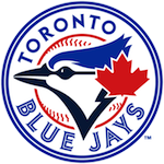
I'd really like to have the logo be without the maple leaf. I'm as patriotic as the next guy (or rather more), but it just looks pasted on. That said, it's a big improvement, better than the original design, and I don't view the maple leaf (or the ball behind, which is rumoured to be included in one variant of the logo) as something that can't be easily dropped.
The maple leaf MAKES the logo. Without it, they may as well be the Orioles (or any other bird-themed team...)
Yeah I wouldn't get rid of the leaf. The red looks sharp among all that blue and white. However, I wish it were just a little smaller, and/or incorporated into the rest of the logo a little better. It's just big enough to be a little distracting. But, I could see it growing on me.
The primary logo supposedly has a baseball behind it, with the Toronto Blue Jays lettering and all that. Can't wait to see the uniforms.
The primary logo supposedly has a baseball behind it, with the Toronto Blue Jays lettering and all that. Can't wait to see the uniforms.
I also wish the red maple leaf was smaller, but I think it should be there. More now than originally - now that les Expos are no more, the Jays are uniquely Canadian.
The subtle improvements to the bird do make me think more of a blue jay. Which is good - the original always reminded me more of a pigeon.
Granted, if Toronto does have a civic bird, it would surely be the pigeon.
The subtle improvements to the bird do make me think more of a blue jay. Which is good - the original always reminded me more of a pigeon.
Granted, if Toronto does have a civic bird, it would surely be the pigeon.
I like the move back to something closer to the original logo, but something about the new one just looks off to me. Like it's lopsided or something. I dont know exactly. I appreciate the sentiment but I still prefer either the original or the current logo.