

I have a confession to make: I slept through most of this game. Thanks to the miracle of technology I am watching it right now, but let me relate to you my chronology:
First Inning: Adams walks, Cat homers, Theo wants lunch. Feed Theo. Rock Theo to sleep, fall asleep in rocking chair.
Second inning through seventh inning: asleep.
Eighth inning: awakened by Theo stirring in time to see Rondell White scrape that homerun just barely over the wall. Spent most of Frasor's time pitching trying feed pureed squash to Theo without getting it all over my jersey.
Ninth inning: outside walking the fussy baby around the backyard while trying to hear Batista close it out on the radio.
Is that some kind of microcosm of the game?
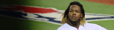
Aside from a few walks and that one pitch that Catalanotto hammered, Bonderman looked quite good for the Tigers. But Downs really impressed me -- I like to believe in the team and in the players on the team, but Downs was one of those guys that I just didn't have a good feeling about. I don't suppose that's particularly fair of me, but that's how I felt going into this game. Actually, I was hoping he'd only let in three or four runs and that the Jays could win this one with their bats.
He showed me.
If I were a real analyst instead of just some guy who takes pictures, I'd tell you all about how Downs was pitching. But since I'm not, I really don't have any capability to do that aside from telling you that he was "great" and then maybe parroting some stuff that Jamie / Rance / Jerry / Warren / Mike said about him.
Frankly, I think that would be cheap of me. So instead I'm going to talk about the Tigers' away uniforms and how I think they're the nicest away uniform in all of baseball.
I freely admit that there's something wrong with me. I have a bit of a mania for baseball uniforms, and I don't know why. I currently own six baseball jerseys and would certainly own more if I could afford them and if my wife wouldn't kill me for buying them. I was recently offered one of my Holy Grails: a game-issued (but unworn) Hank Aaron jersey from 1974, but let's just say that I'm not rich.
I'm in the crowd that likes the new Jays jerseys, aside from the black one. I felt that the previous jersey was just too busy, with too much "snazz" or whatever you want to call it. The current look is minimal but still flashy, and I'm into it.
The Detroit Tigers have what at first looks like a classic road jersey: script letters spelling out the name of the city in a dark colour with a white highlight against grey. But that thin orange outline between the blue letters and the white is just electrifying. I think it takes a standard and gives it a really "modern" edge without pushing it or trying to hard to be fashionably relevant. The Blue Jays have tried to do something similar to this, and while I like it -- the electric blue combined with the two different shiny silver threads is really striking, especially in the sun -- I think they've almost overdone it. I'm confident that the TIgers road jersey will still look like a classic baseball jersey in fifty years, while I fear that the current Jays look will be regarded in the same way that the old powder blue pullovers (or that 1974 Braves jersey) are seen now: so uncool that they're cool, or maybe not, but definitely a product of their time.
I also believe that virtually everyone's "third" jersey is awful -- the D-Rays, the White Sox, the Astros (who've never had a good jersey in the history of the team) and the Cubs all have particularly wretched alternate jerseys. And while I recognize that it's considered a classic, the Detroit "D" is, I think, the ugliest letter-logo in all of baseball. It's better when the cartoon tiger is jumping out of it, but by itself... ugh.
Since it's Friday, and nobody is up for mental heavy-lifting on Fridays, I'd like to see your lists of the best and worst jerseys in baseball. I know we all like to forget they exist, but those of you who are planning to put the new Jays uniforms as your number one worst should take the time to recall the full mismatched horror of the Arizona Diamondbacks.
First Inning: Adams walks, Cat homers, Theo wants lunch. Feed Theo. Rock Theo to sleep, fall asleep in rocking chair.
Second inning through seventh inning: asleep.
Eighth inning: awakened by Theo stirring in time to see Rondell White scrape that homerun just barely over the wall. Spent most of Frasor's time pitching trying feed pureed squash to Theo without getting it all over my jersey.
Ninth inning: outside walking the fussy baby around the backyard while trying to hear Batista close it out on the radio.
Is that some kind of microcosm of the game?
Aside from a few walks and that one pitch that Catalanotto hammered, Bonderman looked quite good for the Tigers. But Downs really impressed me -- I like to believe in the team and in the players on the team, but Downs was one of those guys that I just didn't have a good feeling about. I don't suppose that's particularly fair of me, but that's how I felt going into this game. Actually, I was hoping he'd only let in three or four runs and that the Jays could win this one with their bats.
He showed me.
If I were a real analyst instead of just some guy who takes pictures, I'd tell you all about how Downs was pitching. But since I'm not, I really don't have any capability to do that aside from telling you that he was "great" and then maybe parroting some stuff that Jamie / Rance / Jerry / Warren / Mike said about him.
Frankly, I think that would be cheap of me. So instead I'm going to talk about the Tigers' away uniforms and how I think they're the nicest away uniform in all of baseball.
I freely admit that there's something wrong with me. I have a bit of a mania for baseball uniforms, and I don't know why. I currently own six baseball jerseys and would certainly own more if I could afford them and if my wife wouldn't kill me for buying them. I was recently offered one of my Holy Grails: a game-issued (but unworn) Hank Aaron jersey from 1974, but let's just say that I'm not rich.
I'm in the crowd that likes the new Jays jerseys, aside from the black one. I felt that the previous jersey was just too busy, with too much "snazz" or whatever you want to call it. The current look is minimal but still flashy, and I'm into it.
The Detroit Tigers have what at first looks like a classic road jersey: script letters spelling out the name of the city in a dark colour with a white highlight against grey. But that thin orange outline between the blue letters and the white is just electrifying. I think it takes a standard and gives it a really "modern" edge without pushing it or trying to hard to be fashionably relevant. The Blue Jays have tried to do something similar to this, and while I like it -- the electric blue combined with the two different shiny silver threads is really striking, especially in the sun -- I think they've almost overdone it. I'm confident that the TIgers road jersey will still look like a classic baseball jersey in fifty years, while I fear that the current Jays look will be regarded in the same way that the old powder blue pullovers (or that 1974 Braves jersey) are seen now: so uncool that they're cool, or maybe not, but definitely a product of their time.
I also believe that virtually everyone's "third" jersey is awful -- the D-Rays, the White Sox, the Astros (who've never had a good jersey in the history of the team) and the Cubs all have particularly wretched alternate jerseys. And while I recognize that it's considered a classic, the Detroit "D" is, I think, the ugliest letter-logo in all of baseball. It's better when the cartoon tiger is jumping out of it, but by itself... ugh.
Since it's Friday, and nobody is up for mental heavy-lifting on Fridays, I'd like to see your lists of the best and worst jerseys in baseball. I know we all like to forget they exist, but those of you who are planning to put the new Jays uniforms as your number one worst should take the time to recall the full mismatched horror of the Arizona Diamondbacks.


