
The Blue Jays have a new logo for next, per sports apparel blog Uni Watch. Check it out after the jump.
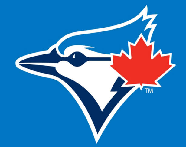
The new logo. The Bird is a little sleeker, the Maple Leaf is lower and more prominent, the blues are slightly different, and the baseball from the background is removed.
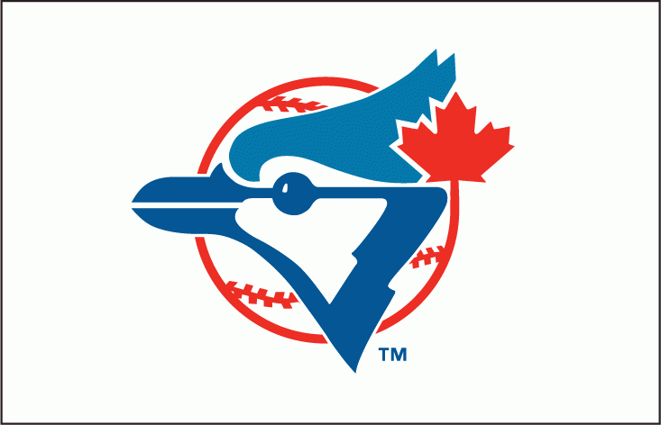
The team's original logo
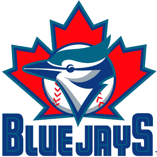
Second logo
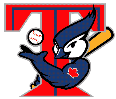
The awful T-Bird
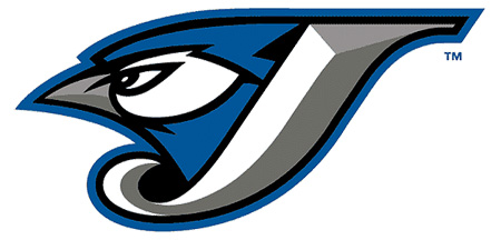
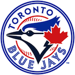
The current, "modern" logo.
Count me in the this is an improvement camp. I like the update of the original design, and it's nice to have something with a more timeless feel, as opposed to something with a bland, angry focus-grouped feel. It will also be nice to get some blue back in the uniform, as opposed to black and slate.
Judging by the cap ratio at the Skydome (usually I see anywhere from 50/50 to 75/25 in favour of the classic logo) this will be something fans can get behind.
The new logo. The Bird is a little sleeker, the Maple Leaf is lower and more prominent, the blues are slightly different, and the baseball from the background is removed.
The team's original logo
Second logo
The awful T-Bird
The current, "modern" logo.
Count me in the this is an improvement camp. I like the update of the original design, and it's nice to have something with a more timeless feel, as opposed to something with a bland, angry focus-grouped feel. It will also be nice to get some blue back in the uniform, as opposed to black and slate.
Judging by the cap ratio at the Skydome (usually I see anywhere from 50/50 to 75/25 in favour of the classic logo) this will be something fans can get behind.
