Batter's Box Interactive Magazine Batter's Box Interactive Magazine Batter's Box Interactive Magazine
Here they are!

The new "Logo For Life" and new uniforms for your Toronto Blue Jays in 2012.  Two thumbs up!!

Update @ 3:15pm: New images added!


BlueJays.com highlights today's unveiling and provides a video of the team's new look.  CP24 also provides coverage with an Adam Lind interview.

Sportsnet's Jamie Campbell was the master of ceremonies and highlighted the main theme that "the blue is back in Blue Jays".  The adjectives by Campbell to describe the logo were simple, traditional, relevant and modern.  President/CEO Paul Beeston also mentioned that designing the new uniforms and logo was a two-year process.  Beeston added the players and manager John Farrell had input into the design.  As he succinctly put it, "We're not the Jays, we're the Toronto Blue Jays."  He also says the red Maple Leaf in the primary logo is an important part of the team's history in that the team represents Canada and are proud of it.  Beeston also commented on the split lettering in an effort to connect the team's past with the future, mentioning the names of Doug Ault, Ron Fairly, Bob Bailor, George Bell, Dave Stieb, Joe Carter, Robbie Alomar, Jose Bautista and Ricky Romero.  He admits there was debate and heated arguments among team officials before arriving at the final design.  Beeston also says the new logo is modernized and energized from the original logo back in 1976 and that the difference can be seen when they are put side by side.

During the video prior to the unveiling of the uniforms, J.P. Arencibia says the modernized look is what he "grew up knowing - the bird, the uniform.  Brett Lawrie says the different look will "turn some heads" and believes 2012 will be their year.  GM Alex Anthopoulos says the new look "merges the greatness of the past" from the Pat Gillick/Paul Beeston era.


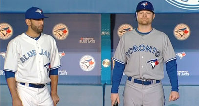
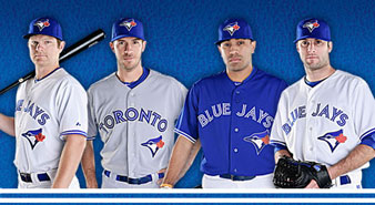
Jose Bautista and Adam Lind model the home white and road gray uniforms respectively.

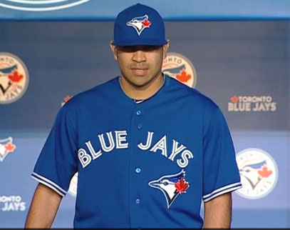
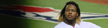
Ricky Romero dons the alternate blue jersey that will be worn at home and on the road.

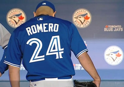
Romero shows off the back of the alternate blue jersey.

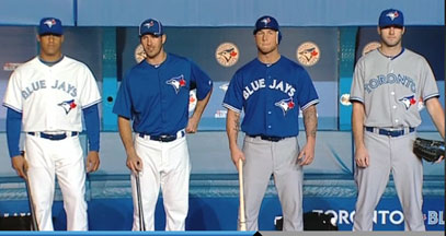
Yunel Escobar in home white, J.P. Arencibia shows off the batting practice uniform while Brett Lawrie and Brandon Morrow wear the road gray pants with their jerseys.
Also today, there is a special autograph session at the Jays Shop at Sears (Yonge at Dundas) today from 5:00 to 6:00 p.m.  Ricky Romero, Adam Lind, Brandon Morrrow and J.P. Arencibia will be doing the scrawling and scribbling.  Get there early.  The lineup will probably begin at the Air Canada Centre! ;D 

It's a good day to be a Jays fan, isn't it?  I love the new look and I hope Mrs. Brumfield will get me some merchandise to update my wardrobe.  I can't wait for Opening Day.
Blue Jays Unveil New Logo & Uniforms For 2012!! | 59 comments | Create New Account
The following comments are owned by whomever posted them. This site is not responsible for what they say.
John Northey - Friday, November 18 2011 @ 12:22 PM EST (#246878) #
Nice logo. Uniforms are button down and make me think of the early 90's version (still have a road/home from then but I've grown too much to fit). Slight difference in script on the uniforms from the past, but not drastic.

I'd buy one.
Forkball - Friday, November 18 2011 @ 12:22 PM EST (#246879) #
Took two years to just about get it back to the original logo?  I'm glad the rest of the front office can move quicker than that.

I like it; they never should have changed it in the first place.

MrPurple - Friday, November 18 2011 @ 12:29 PM EST (#246881) #
Looks amazing! I am overjoyed, having chills watching the announcement!

92-93 - Friday, November 18 2011 @ 12:30 PM EST (#246883) #
Absolutely love the new look. If I can gripe, though, it's about the size of the logo on the hats.
Ryan C - Friday, November 18 2011 @ 12:42 PM EST (#246885) #
I still prefer the original, but this one is pretty close. Not a big fan of the stomach patch either, but that's not the fault of the logo.
BlueJayWay - Friday, November 18 2011 @ 12:51 PM EST (#246886) #
Really good.  Looks like the Blue Jays again.
greenfrog - Friday, November 18 2011 @ 12:54 PM EST (#246887) #
Looks good - sharp. Love that the blues are back (and that they don't look like PJs). I agree that the cap logo is pretty big and splashy, but I can probably get used to it.
Mike Forbes - Friday, November 18 2011 @ 01:01 PM EST (#246888) #
Awesome. Love the blue alternates. It's old school with just enough modernization. Justin Jackson and Justin Nicolino seem to be big fans too.
Rich - Friday, November 18 2011 @ 01:06 PM EST (#246889) #
They did this right.  The black was an abomination.  And there was never any good reason to deviate much from the original logo.  Yes it's a product of the 70's, but that's when the team's heritage dates to.

There's a reason that the best MLB uniforms are the classics - because they don't change much if at all.  Hopefully the Blue Jays will be wearing similar duds 20 years from now.  The shirt logo is a bit strange (and always has been) but that's ok, it helps make this identity the team's own.

Lylemcr - Friday, November 18 2011 @ 01:07 PM EST (#246890) #

I like how AA said that this is the logo he grew up with.  Me too. 

I tell my wife that the Jays should be playing with the big boys.  She says that they don't have any tradition.   People forget how great the Jays were in the 80's. 

The Jays are doing so many things right. 

Respect! 

China fan - Friday, November 18 2011 @ 01:08 PM EST (#246891) #
The shirts look a little lopsided to me, with the logo dragging everything down to the lower left.  But I've got a bigger confession to make:  I don't understand why everyone is so excited about this.  I'm shrugging my shoulders, looking at a logo that seems roughly the same as it's (mostly) always been.  Maybe it's because I don't live in Toronto and don't buy merchandise, but I don't get the hype of today's event. People are actually getting excited about this?
Flex - Friday, November 18 2011 @ 01:27 PM EST (#246894) #
People are actually getting excited about this?

People are very excited about this. I'm 51 and I'm excited. And I don't buy merch. It's all about cheering for laundry, after all, and this is the best laundry the Jays have had in decades. I would go so far as to say it improves on the original design.
MatO - Friday, November 18 2011 @ 01:35 PM EST (#246895) #
I have to admit that I don't care either.  Battersbox is going to have to update that Blue Jay logo on the left.
TamRa - Friday, November 18 2011 @ 01:59 PM EST (#246896) #
I like everything about them. most especially, no white-face cap (which was the one thing I didn't like about the glory days unis)
Glevin - Friday, November 18 2011 @ 02:10 PM EST (#246898) #
"Absolutely love the new look. If I can gripe, though, it's about the size of the logo on the hats."

My feelings exactly. The best new uniforms this off-season. Glad to say good-bye to black.
92-93 - Friday, November 18 2011 @ 02:15 PM EST (#246900) #
"I'm shrugging my shoulders, looking at a logo that seems roughly the same as it's (mostly) always been."

Where have you been for the last 15 years, China Fan?
Matthew E - Friday, November 18 2011 @ 02:34 PM EST (#246904) #
It's fine.

But it doesn't matter.

What matters is, how does the team do on the field? The little cakewalk they had today doesn't change that a bit.

China fan - Friday, November 18 2011 @ 02:47 PM EST (#246905) #

.....Where have you been for the last 15 years, China Fan?

Not in Toronto.  But looking at the "angry bird" logo at the top left of Batter's Box, and comparing it to the "retro look" of the new logo, I'm overwhelmed by a feeling of ennui.   I'm often amazed at what people care deeply about.   Of course I sometimes care deeply about minor movements on the Blue Jays roster, so who am I to judge anyone else's level of excitement?

rpriske - Friday, November 18 2011 @ 03:15 PM EST (#246908) #
Brian Jeroloman has been claimed off waivers by the Pirates/
rpriske - Friday, November 18 2011 @ 03:27 PM EST (#246912) #

Now Craig Kimball has been reclaimed by the Nationals and the Jays have claimed Andrew Carpenter from the Padres.


Musical chairs time...

#2JBrumfield - Friday, November 18 2011 @ 03:32 PM EST (#246914) #
If I can gripe, though, it's about the size of the logo on the hats.

It's not like you to gripe about anything, is it?  Should they should shrink the logo so you can't see it whatsoever?  I think the size of the logo is fine.  You want your logo to be noticeable.  We don't need an Edmonton Eskimos situation when they decided to shrink the logo on their helmets after the Warren Moon era or the Cleveland Indians for that matter when they shrunk the Wahoo on their caps (though, for racial reasons, it's understandable).  This is a great new look for the mighty Blue Jays.  I'm totally loving it!


jgadfly - Friday, November 18 2011 @ 03:36 PM EST (#246915) #
As per MLBTR ...  The Blue Jays announced that they added catcher Travis d'Arnaud, first baseman Michael McDade, right-hander Nestor Molina and left-hander Evan Crawford to the 40-man roster. They have two empty spots on their 40-man.
jgadfly - Friday, November 18 2011 @ 03:59 PM EST (#246917) #
Minus Kimball and Jeroloman to 33 ... plus Carpenter to 34 ... plus above 4 makes it 38 ... leaving 2 openings .
jgadfly - Friday, November 18 2011 @ 04:07 PM EST (#246919) #
Anybody else thinking of changing their nom-de plume to Robbie'sBlueHaze ?
Alex Obal - Friday, November 18 2011 @ 04:08 PM EST (#246920) #
It's fine. But it doesn't matter.

I disagree. A baseball cap is supposed to be a token of civic pride. I'm not sure whether the new one quite counts, but it's a lot closer than the angry bird. Anyone can tell this one is a blue jay from somewhere in Canada.
Ron - Friday, November 18 2011 @ 04:13 PM EST (#246922) #
I find it odd that one of the jerseys features "Toronto" in the front considering the Jays have really made a strong push in the past year to market the Jays as Canada's team.

Without having seen all the details, I'm already not a big fan of the draft aspect of the new CBA. Removing draft picks from teams that spend in the draft is going to hurt the Jays and a lot of small revenue clubs. I think it's silly that kids born in the United States and Canada are financially punished under the current system while kids from places like Cuba and Venezuela are free from the stupid slot recommendation system.
Matthew E - Friday, November 18 2011 @ 04:19 PM EST (#246924) #
I disagree. A baseball cap is supposed to be a token of civic pride. I'm not sure whether the new one quite counts, but it's a lot closer than the angry bird. Anyone can tell this one is a blue jay from somewhere in Canada.

All of which adds how much to the Jays' win total?
Original Ryan - Friday, November 18 2011 @ 04:19 PM EST (#246925) #
I like the uniforms overall. The logo looks a lot better with the baseball, and I assume MLB's stupid rule preventing baseballs on the front of uniforms forced the Blue Jays to drop it on the caps and jerseys. I'm not quite sure why they were able to get away with it with the 1977 logo.
Gerry - Friday, November 18 2011 @ 04:23 PM EST (#246927) #

I find it odd that there are 38 players on the 40 man roster.  The Jays need to add a catcher, a second baseman, and several relievers.

Some combination of Brad Mills, Darin Mastroianni, Mark Teahen, Trystan Magnuson and Jesse Chavez must be on the bubble.

Flex - Friday, November 18 2011 @ 04:35 PM EST (#246931) #
I find it odd that one of the jerseys features "Toronto" in the front considering the Jays have really made a strong push in the past year to market the Jays as Canada's team.

Hmmm. Trying to decide if this is sarcasm, because if it isn't it makes no sense. The team is the Toronto Blue Jays, right? Not the Canada Blue Jays. The uniform that features "Toronto" is the road uniform. This is entirely traditional, nothing odd about it.
Original Ryan - Friday, November 18 2011 @ 04:46 PM EST (#246933) #
Hmmm. Trying to decide if this is sarcasm, because if it isn't it makes no sense. The team is the Toronto Blue Jays, right? Not the Canada Blue Jays. The uniform that features "Toronto" is the road uniform. This is entirely traditional, nothing odd about it.

I also thought the Blue Jays might drop "Toronto" on the road jerseys and just duplicate the home uniforms for the reasons Ron mentioned, although I'm glad they didn't. For years the Orioles tried to extend their appeal by not including their city on the road uniforms. In recent years both the Angels and Rays have dropped the city/region from their road uniforms in order to build their respective brands.

Alex Obal - Friday, November 18 2011 @ 04:49 PM EST (#246935) #
All of which adds how much to the Jays' win total?

Assume for the sake of argument the answer is 0. It's clearly a positive, because a pro baseball team actually does serve functions beyond competing for championships. If the Red Sox' logo were a picture of the Manhattan skyline with "Boston" on it, it would be totally unwearable in public (fans lose!) and thus there would be very little point to buying their official merchandise (owner loses!). Obviously the difference here isn't quite that stark, but it's been met with almost universal praise.

For the record, my empirical research suggests the new uniforms will increase the Jays' win total by 0.6 this year, and that the difference between the new and old uniforms should increase logarithmically.
John Northey - Friday, November 18 2011 @ 04:57 PM EST (#246936) #
The fact it is easy to list 5 guys who are on the 40 man who don't need to be, along with 2 open slots, suggests the Jays still have a couple of years until the cupboard is overflowing. A shame to lose a few of the guys but none were exactly 'A' level talent.
zeppelinkm - Friday, November 18 2011 @ 05:08 PM EST (#246938) #
Has anyone seen this critique of the Jay's new logo?

http://flipflopflyball.tumblr.com/post/12975588896/my-pal-scott-tipped-me-off-to-this-excellent

Going through the items a lot of them make sense. But my question is, if all of those "design violations" or however you'd like to call it, were corrected, would the logo be significantly more appealing to the eye? Or are those changes "statistically insignificant" to the human eye when all is said and done?
China fan - Friday, November 18 2011 @ 05:27 PM EST (#246940) #
For those who were closely watching the 40-man roster:  were any significant minor-leaguers left unprotected and exposed for the Rule 5 draft after the Jays added the four names to the 40-man today?  Today was the deadline, so anyone not added to the 40-man and eligible for the draft could be lost. Any familiar names?
Ducey - Friday, November 18 2011 @ 05:44 PM EST (#246941) #

I didn't mind the black uni's but hated the fact that the "Jays" and the "Rays" had essentially the same nickname and a very similar logo on the front of their jerseys.  I welcome the "Blue Jays" back (along with the maple leaf in the logo).

Now Craig Kimball has been reclaimed by the Nationals

He really is the fugitive.

Ron - Friday, November 18 2011 @ 06:12 PM EST (#246942) #
Hmmm. Trying to decide if this is sarcasm, because if it isn't it makes no sense. The team is the Toronto Blue Jays, right? Not the Canada Blue Jays. The uniform that features "Toronto" is the road uniform. This is entirely traditional, nothing odd about it.

Original Ryan save me some time with his reply. When the Jays headed out West last year during their Winter Caravan tour, they made it clear the Jays weren't Toronto's team but all of Canada. Having Toronto splashed across your road uniform goes against this line of thinking (at least from my point of view).


TamRa - Friday, November 18 2011 @ 06:22 PM EST (#246943) #
"The logo looks a lot better with the baseball"

I completely feel the opposite - much better without.

"Some combination of Brad Mills, Darin Mastroianni, Mark Teahen, Trystan Magnuson and Jesse Chavez must be on the bubble."

Won't Alan Farina miss all (or virtually all) of 2012? Seems to me he's an obvious candidate to be taken off but today's the deadline to prep for the Rule 5 isn't it?
BlueJayWay - Friday, November 18 2011 @ 06:52 PM EST (#246945) #
Reaction all around the baseball world is overwhelmingly positive.  Even fans of other teams are saying this looks great, the uniforms are beautiful, and the Jays look like they should.
uglyone - Friday, November 18 2011 @ 06:58 PM EST (#246947) #
these unis are absolutely gorgeous.

they nailed it. that's a perfect re-design. right back to our tradition, but totally slick and updated.
TamRa - Friday, November 18 2011 @ 07:12 PM EST (#246948) #
"Any familiar names?"

Not unless someone wants to try Jon Diaz as McDonald 2.0

MAYBE Matt Wright...I'd be pretty stunned about anyone else.
Mike Forbes - Friday, November 18 2011 @ 07:13 PM EST (#246949) #
Indians designated Luis Valbuena for assignment today. Could be a good pickup for the Jays. Plays second, short, third and some outfield. Good guy to battle with McCoy for the utility role. As a plus, he can hit a bit too.
Gerry - Friday, November 18 2011 @ 07:22 PM EST (#246952) #
Farina might slip through, but the Nationals thought Kimball would too. Both are injured pitchers who will miss a lot of 2012.
bpoz - Friday, November 18 2011 @ 07:45 PM EST (#246953) #
Can't protect everyone. I like Scott Richmond. I think he is healthy. He could do OK in the Jay's pen. LV destroys him & a lot of other pitchers.

I don't like LV for our pitchers. I cannot tell if our guys can't handle AAA or LV.
I also think Mills & Cecil made adjustments for success at LV and those adjustments hurt at the Majors. Specifically IMO pitching down in the zone is good in the Majors but maybe not so good in LV. Ashby kept saying that both, especially Cecil has to get the ball down or he will pay.

Dave Till - Friday, November 18 2011 @ 08:02 PM EST (#246954) #
I love the new logo. It feels like returning home.

The uniforms are good too, though I would have liked them a bit better if the uniform numbers and the "Toronto" and "Blue Jays" were sans-serif. But that's a minor quibble. I think I'm gonna go out and buy me a ball cap sometime soon.

smcs - Friday, November 18 2011 @ 08:36 PM EST (#246955) #
Having Toronto splashed across your road uniform goes against this line of thinking (at least from my point of view).

That only makes sense (not putting 'Toronto' on the road jersey for fear of alienating the rest of Canada) if the Jays are considering renaming them the Canada Blue Jays. If the Jays don't think the fact that the team is based in Toronto is too much to overcome insofar as winning over fans across Canada, then putting Toronto on the jersey shouldn't really matter, I don't think.
Dave Till - Friday, November 18 2011 @ 09:17 PM EST (#246957) #
Putting the city name on the road uniform is a time-honoured baseball tradition. Virtually everybody does it. Even the Yankees.
mathesond - Saturday, November 19 2011 @ 12:21 AM EST (#246959) #
And if Canada is home to the Jays, you would expect them to wear the home unis on the cross-Canada caravan
TamRa - Saturday, November 19 2011 @ 04:32 AM EST (#246960) #
I should revise my previous remarks - I was speaking of the major league portion of the draft. I'm sure there are several that might go in the minor league portion - Wright first among them.
Magpie - Saturday, November 19 2011 @ 04:44 AM EST (#246961) #
I love the new logo. It feels like returning home.

Ditto. This is the laundry I signed up for...
John Northey - Saturday, November 19 2011 @ 01:40 PM EST (#246972) #
Whats funny is that some kids today will be disappointed as they grew up with the 'fighting Jay' logo (thinking kids 15 and under). So in 20 years I could see the Jays using the old logo for old timers days.
BlueJayWay - Saturday, November 19 2011 @ 05:14 PM EST (#246979) #
I doubt many will be that disappointed.  Even the younger types that I see wearing Jays hats feature the original logo a large percentage of the time.
bpoz - Saturday, November 19 2011 @ 06:05 PM EST (#246982) #
If the Jays become good fast, some people (me) are going to get superstitious and attribute the winning to the uniform.

Original Ryan - Saturday, November 19 2011 @ 06:18 PM EST (#246983) #
If the Jays become good fast, some people (me) are going to get superstitious and attribute the winning to the uniform.

The Blue Jays have finished last in the A.L. East the three previous times they introduced a brand new set of uniforms (1977, 1997 and 2004). Based on that history, I fully expect a 110-loss season for the club in 2012.

bpoz - Saturday, November 19 2011 @ 06:35 PM EST (#246985) #
OH MY GOODNESS.

YOU will have to eat your words if they win 53 games.

greenfrog - Sunday, November 20 2011 @ 11:19 AM EST (#247001) #
Original Ryan, clearly that's because those uniforms weren't as cool as these ones. It's a statistical fact that smarter uniforms produce better results. It's the new market inefficiency. Why else would AA be making such a big deal about this?
#2JBrumfield - Sunday, November 20 2011 @ 11:53 PM EST (#247015) #
The Blue Jays have finished last in the A.L. East the three previous times they introduced a brand new set of uniforms (1977, 1997 and 2004). Based on that history, I fully expect a 110-loss season for the club in 2012.

If it's true that everything happens in threes, the Jays should be in the clear as far as finishing last. ;D

It's strange there is no split lettering in Toronto in the primary and other trademark logos but not on the road jersey itself.  Maybe it's a tribute to the early 70's road jersey.

Steve Staggs 78

I could see the team adding another cap in the future.  I think one with a "T" on it would look good even if it's stealing Texas' look.  The best news of all is the toothpaste 'T' is gone!! :D

jgadfly - Monday, November 21 2011 @ 04:58 PM EST (#247042) #
So with the breaking news of a new CA (taxes, fines and penalties for Itnl. and overdraft signings)  has AA been voted off the Island or has he just been sent to the 'naughty chair' by kindergarten master Selig ?
bpoz - Monday, November 21 2011 @ 07:09 PM EST (#247049) #
We still need more details on this Bonus Taxing deal. The tax rate is key.

It could be a 100% rate, that is just a guess.
Also guessing, round by round rate or any $ over a budget is taxed with an increasing rate based on different levels.

HS player has the option of not signing and going to college. The 3rd pick in round #1 may expect more than the 23rd pick in round #1 but would they have a different slot level.
I think this hurts TB big time.
Hopefully you can pick again next year, rather than lose the unsigned pick.
Costs should decrease and some players will fall, IMO. This could be a boon for teams unfazed? by the tax...maybe?
Blue Jays Unveil New Logo & Uniforms For 2012!! | 59 comments | Create New Account
The following comments are owned by whomever posted them. This site is not responsible for what they say.