Batter's Box Interactive Magazine Batter's Box Interactive Magazine Batter's Box Interactive Magazine

That was the question Bob McCown posed to Stephen Brunt during the 4:00 hour on Monday's edition of Prime Time Sports.  Brunt answered he was okay with them and that they are better than the 70's version.  McCown then said, "if you like the current jersey, you better go get one because this time next year, they won't be available."  McCown said he did not know what the proposed new uniforms will look like but guessed it would be closer to the original version or a combination of the new and old one.  There appears to be further proof that McCown is on to something because the Jays have joined forces with a marketing firm for re-branding purposes.

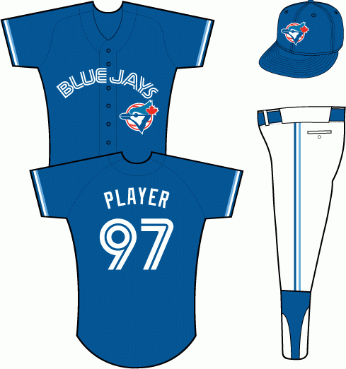
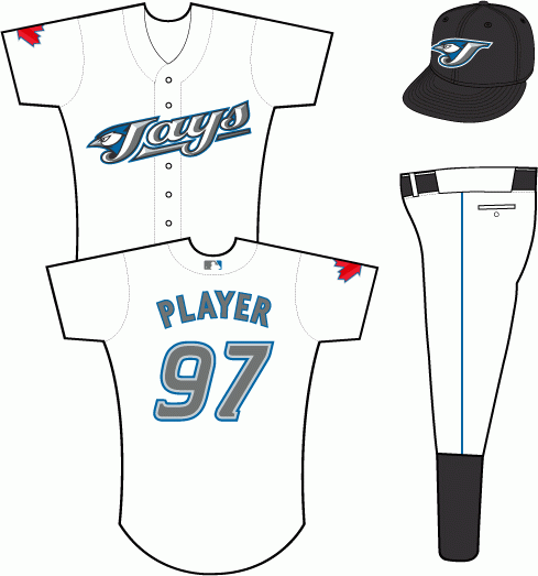
     The 1994-1996 alternate uniforms (best in team history!)                                           The current day uniforms.

Images provided by Sportslogos.net.


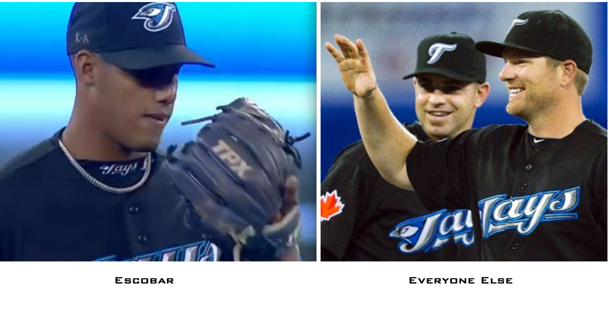
What I would like to see is the Jays keeping the current J-bird logo and their current road uniform and replace the Jays script logo on their black and white uniforms with the same style lettering on the road unis.  More importantly, how about an actual blue uniform because it is ridiculous they don't have one this year after scrapping the powder blues this season.  I also hope they lose the toothpaste caps and I'm not the only one who thinks so.  I know Yunel Escobar has got my back on this.  According to Uniwatchblog.com, Escobar wore the J-bird cap Saturday against the Twins while everyone else wore the toothpaste cap.  


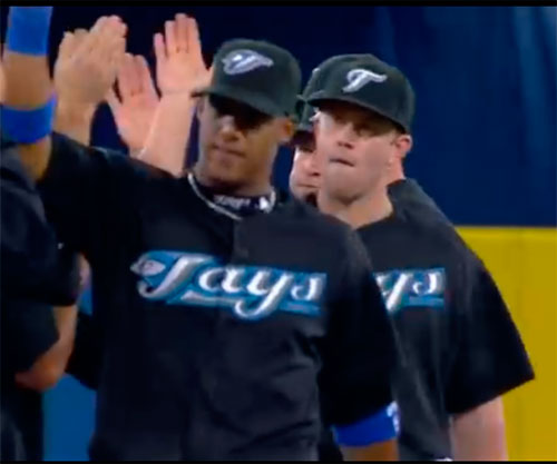
Yunel Escobar takes part in Saturday's post-game celebration with his J-bird cap while Aaron Hill and everyone else wears the toothpaste one.

In other uniform related matters...

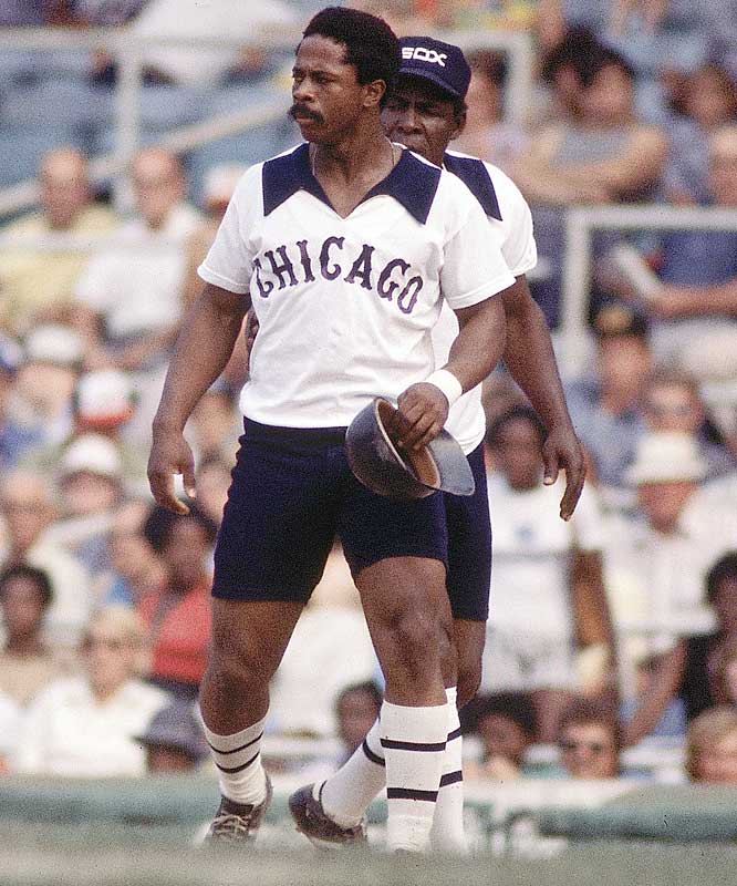
  • Uniwatchblog.com also digs up a blast from the past of when the Jays first modelled its 1977 uniform.
  • Random Observation...Whoever stitched the names on Kyle Drabek's and Jayson Nix's jerseys did a sloppy job.  Drabek looks like Dr. A. Bek and Nix looked a little too spread out.  I can only imagine what would happen if the Jays acquire Fu-Te Ni

With a new uniform apparently on the way for 2012, what do you want to see, Bauxites?  The floor is yours.

Do You Like The Blue Jays Uniforms? | 26 comments | Create New Account
The following comments are owned by whomever posted them. This site is not responsible for what they say.
Jeremy - Tuesday, April 05 2011 @ 11:28 AM EDT (#232151) #
I'm a fan of the '89-96 uniforms.  I hope they go with the blue and white cap, at least for home games; the style that Bautista's wearing in the banner.
Forkball - Tuesday, April 05 2011 @ 11:33 AM EDT (#232153) #
They got the logo correct right from the beginning.  I can do without the white front - just a solid blue is fine. - but the logo is perfect: baseball, blue jay, maple leaf.

The worst thing they can do is try too hard and end up with something like the Ranger logo.

Christopher - Tuesday, April 05 2011 @ 11:49 AM EDT (#232155) #

I don't know if I'd go back to the exact original, but perhaps an update on it, such as:

http://s1194.photobucket.com/albums/aa371/CHR1SB1/?action=view&current=jays_hahn_02_v2.png


Craig B - Tuesday, April 05 2011 @ 11:59 AM EDT (#232156) #
Coloured jerseys and white pants are never, ever, ever, ever, ever the correct answer. Never.
Jonny German - Tuesday, April 05 2011 @ 12:10 PM EDT (#232159) #
I agree that the toothpaste T is terrible, and that's a good description for it. I don't agree that the original logo was better than the current - lots of nostalgic value, but without that no one would love it. Christopher's link is a good example of how it would be better if simplified.

The current maple leaf on the right sleeve is a powerful and appropriate nod to the fact that the Jays are The Canadian Team. I'd leave that exactly as is and wouldn't add any more red.

I'm with CraigB on no coloured jerseys (including blue, and I'm against all-blue unis as well).

And mandatory high socks for all players!
Kelekin - Tuesday, April 05 2011 @ 12:21 PM EDT (#232160) #
Come on, no satin royal blue jerseys guys?

I actually don't mind our black jerseys -that- much, although more blue and less white would've been nice.  Not a huge fan of the white and grey ones though.

ayjackson - Tuesday, April 05 2011 @ 02:19 PM EDT (#232164) #
I could care less.  They all look the same to me.  Nothing's as good as the mid-nighties Expo pinstripes!  (especially worn by Revlon girls - shake your body!)
Mike Green - Tuesday, April 05 2011 @ 02:28 PM EDT (#232165) #
Travis Snider figures to be on the club for the next 5-10 years, and with thin pinstripes already being taken, it seems to me that black is the logical long-term aesthetic choice.
Alex Obal - Tuesday, April 05 2011 @ 03:24 PM EDT (#232166) #
After noticing an evolution of its fan base, the Toronto Blue Jays recognised the need to rejuvenate and refresh its brand. / Our global experience and expertise with the model has enabled us to effectively develop a new brand strategy for the Toronto Blue Jays which is set to keep them one step ahead of the game.

This mentality is why the Jays will likely never have a timeless logo. Oh well.

92-93 - Tuesday, April 05 2011 @ 03:24 PM EDT (#232167) #
It helps to keep perpetuating the myth that Snider is fat.
Mike Green - Tuesday, April 05 2011 @ 03:30 PM EDT (#232169) #
The man is a wide-bodied athlete, and he aint going to get taller or thinner. 
dan gordon - Tuesday, April 05 2011 @ 04:05 PM EDT (#232170) #

I like the black jerseys with white and blue trim.  I like the original logo, and not for nostalgic reasons.  I hate the powder blue - I think it looks wimpey.  I remember an interesting study done on uniform colours in the NFL and the NHL.  The study found that teams wearing black got more penalties than other teams.  It was by a pretty wide margin, too.  At the time, it was not determined the extent to which the extra penalties were as a result of the referees handing out more penalties because they subconsciously associated the black uniforms with a more aggressive, tough, unruly style play, or as a result of the players actually playing that way.  Maybe some of both.  Since penalties aren't really assessed in baseball (well, I guess you could call a balk or catcher's interference or running outside the lane to 1st base a penalty, that kind of thing, but they aren't really significant parts of the game) it's not an issue in that sport.  Speaking of which, that would be kind of interesting if there were penalties in baseball - what would you do, have a team play with only 8 men in the field for an inning?  Give the other team 4 outs?

Whenever the talk turns to uniforms in baseball, I remember the time the White Sox wore shorts and white tops with huge black collars as part of their uniform for a game back in 1976.  If you've never seen them, do yourself a favour and google it.  Good for a laugh.   

TamRa - Tuesday, April 05 2011 @ 06:16 PM EDT (#232179) #

I don't know if I'd go back to the exact original, but perhaps an update on it, such as:

http://s1194.photobucket.com/albums/aa371/CHR1SB1/?action=view&current=jays_hahn_02_v2.png


Oh my. That's excellent. 


Here's another suggestion, which flips what's old and what's new in your link

http://twitpic.com/4h8xij


My preferance would be to find a way to intigrate the early-90's uni with the modern ones. If possible. The two things i do NOT want is (1) any hint of powder blue, and (2) no white-face two-tone cap. 

Also, you seldom here it mentioned, but that charcoal gray uni top they had a couple of years ago was really sharp, IMO.

Craig B - Tuesday, April 05 2011 @ 06:27 PM EDT (#232182) #
To be clear - coloured jerseys are fine. The powder blues are high class, in a wide-tie-and-big-lapels stylee. It's the mix of coloured jerseys and white pants that is abhorrent.
Seamus - Tuesday, April 05 2011 @ 06:32 PM EDT (#232183) #
They have to go back to the original logo, I think.  People still identify with it - I'd say you see more of those hats on fans than the current ones.

So I say go back to the classic hats with either a white or blue background.

I don't mind about the uniforms so much.  Just please return the colours to blue and white.  They are the traditional Blue Jay colours, and it keeps the tradition of having Toronto teams use Blue and White in their uniforms (Raptors and FC excluded I guess).

rtcaino - Tuesday, April 05 2011 @ 08:18 PM EDT (#232189) #
The two things i do NOT want is (1) any hint of powder blue, and (2) no white-face two-tone cap.

So you do want a white faced two-tone cap?

I also do not understand what is wrong with a blue top and white pants -- I didn't mine those jerseys, but I also wear white after Labour Day. (Quite boorish, I'm aware.)
doolox - Wednesday, April 06 2011 @ 12:17 AM EDT (#232197) #
The Jays top selling logo on merch has been the original and their top selling jersey has been the baby blue jersey since it's debut. I don't know any hardcore or casual fans that identify the team with the J-bird over the ORIGINAL logo. The below article is a couple years old, but data on merchandise sales for specific teams is really hard to find. Therefore, I do see an economic boost for the team if they go back to the original or a go with a  variation of it.

http://www.citytv.com/toronto/citynews/life/money/article/2480--from-retro-to-riches-classic-blue-jays-logo-a-merchandising-monster

Personally, I did not mind the J-bird when it arrived in '04. However, the jerseys they introduced were awful, except for the road uniforms. Since then I still don't and don't feel that most  fans identify the J-Bird as the BLUE JAYS logo. There is a nostalgia associated with the original logo. However it is much more traditional looking, while I find the J-bird to be somewhat minor league looking. I am not sure if the J-bird's intent was to appeal to kids, but I am a traditionalist when it comes to logos & I don't like the look of the J-bird overall or that weird 'T'. Whatever the changes are, I hope the logo is at least somewhat similar to the original & that we will see a blue uniform used regularly. Blue, white and black would work for me as the team's colors. I was not a fan of red on the uniforms when it was put on the uniforms in 1997.

Below is a pic of the Jays original logo with a couple of changes to the colors. It has a dark blue head and a black beak. Anatomically speaking, it would be correct. lol. But a change as subtle as this I think would be well received.  If the team decides to scrap the J-bird, I wouldn't shed a tear watching it go. If the original logo, or something close to it, returns I will be a pretty happy man & very likely to be buying more merch in the long and short term!

http://i153.photobucket.com/albums/s216/doolox/JaysoLd.jpg

Timbuck2 - Wednesday, April 06 2011 @ 01:58 PM EDT (#232218) #
I agree that this simplified logo is fantastic!  The Jays have been around long enough that I think most people KNOW that they are a baseball team without having the baseball in the background.

And as for the Chicaco Black shorts here's a great shot.  The "model" looks incredibly familiar and I'm ashamed I can't remember his name....
Mike Green - Wednesday, April 06 2011 @ 02:12 PM EDT (#232219) #
That looks like Ralph Garr to me.
9293bluejays - Wednesday, April 06 2011 @ 03:55 PM EDT (#232229) #

I am a fan of the alternated jersey's from 94-96

Same as the white uni's worn during the 93 season but dark blue

Rich - Wednesday, April 06 2011 @ 05:42 PM EDT (#232243) #
Any of the logos linked in this thread would be an improvement.

The black needs to go, period.  It was a terrible idea to begin with.  The team is called the BLUE Jays for crying out out loud and it doesn't take a marketing expert to figure out what the main colour should be.

IMHO baseball teams at any level should have 2 sets of uniforms: home whites and road greys, both with buttoned shirts and belts.  Personally I loathe anything else.  The Jays should create uniforms that they will still be wearing 20 years from now.  Make 'em classic, make 'em good, include a healthy dose of the original look, and then leave 'em the heck alone.

DriveOf85 - Thursday, April 07 2011 @ 11:40 PM EDT (#232346) #
This re-branding of the Blue Jays and their uniforms+logos is GREAT news. I hope they go back to the original logo, along with the 1989-1993 or 1994-1996 uniform (or a respectful variation of it).

If you'd like to see the great original logo (and uniforms) come back permanently, NOW is the time to tell the Blue Jays organization. Write them at fanfeedback@bluejays.com.

And feel free to join this Facebook group: http://www.facebook.com/group.php?gid=2265558214
doolox - Friday, April 08 2011 @ 12:36 AM EDT (#232349) #
Hey Drive, that facebook link isn't working for me. I think the Jays management is listening. But not to the fans, the J-bird doesn't sell. Economics will bring back the original or a variation of it.
doolox - Saturday, April 09 2011 @ 05:33 PM EDT (#232438) #

Stroumoboulopoulos  at CBC.ca.
http://www.cbc.ca/strombo/george-feed/sports-1/which-blue-jay-logo-do-you-like-best.html
On Strombo's web poll: 90% want the original, 84% do not prefer the CURRENT logo. Not scientific, but pretty definite stats.
http://urtak.com/u/5670?explore=true?set_lang=en

Other Opinions:
http://infieldfly.wordpress.com/2011/03/28/cheering-for-laundry/
http://www.bluejayhunter.com/2011/04/gone-away-is-new-bird-here-to-stay-is.html

Sounds like a lot of us are not alone in wanting the Original back!!!


DriveOf85 - Sunday, April 10 2011 @ 10:58 PM EDT (#232520) #
@Doolox, try this Facebook link again: http://www.facebook.com/group.php?gid=2265558214
And thanks for posting the links you just put up. Hopefully this ball is rolling!
Jackson - Tuesday, July 12 2011 @ 07:49 PM EDT (#238551) #
http://www.facebook.com/groups/2265558214

Petition!

Do You Like The Blue Jays Uniforms? | 26 comments | Create New Account
The following comments are owned by whomever posted them. This site is not responsible for what they say.