Batter's Box Interactive Magazine Batter's Box Interactive Magazine Batter's Box Interactive Magazine
Just got this in the mail this evening:


INSIDE PITCH: August 28, 2003

Be at SkyDome on Sept. 3 for a sneak preview of the
2004 Jays

You've heard the rumors. Come see for yourself what it is
all about. Sept. 3 will be a special day in Blue
Jays history, that you won't want to miss.


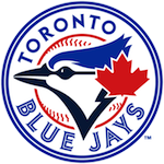
I assume that this is promoting the new logo. (Either that, or the Jays are about to announce that they've signed the entire Yomiuri Giants roster.)

What do you think the new logo will look like? What do you want it to be? Do you care?
A nation breathlessly anticipates the new logo | 34 comments | Create New Account
The following comments are owned by whomever posted them. This site is not responsible for what they say.
_David - Thursday, August 28 2003 @ 11:09 PM EDT (#93413) #
I think the suprise will be the signing of Carlos Delgado to a lifetime contract extension.

In lieu of actual salary .....

_StephenT - Thursday, August 28 2003 @ 11:17 PM EDT (#93414) #
I recall hearing (a few years ago?) that the reason the Jays schedule on off day after Labour Day (even in the middle of a series) is because they had found that the first day back to school was among their worst-attended nights. (Even if true, I still doubt it's a big enough effect to justify an off day in the middle of a series.) By extension, they may also have been concerned about the next day back (Sept 3), which might be why they are doing extra to promote it.

What I want to see, of course, is the original logo (1977-96) brought back. I doubt yet another new logo will impress me. (Though if they get rid of the red lettering on a blue background (i.e. those awful Sunday home uniforms), that at least might be progress).

Sept 3 is also supposed to be the 2nd home game televised in high-definition on Sportsnet HD (the first being Labour Day, Sept 1). (I get the Rogers HD service here in Ottawa, so I'm looking forward to the better pictures for 13 September games. Of course, HDTV is still not as good as being there.)
_Simon - Thursday, August 28 2003 @ 11:43 PM EDT (#93415) #
Like to see the bluejay head by itself for the main logo. Keep the script but change the layout of it, maybe make some nice third jerseys or something. Some drastic isn't really in order, with winning comes merchandise success. You can't fake history, you have to make it.
_Ryan - Friday, August 29 2003 @ 08:33 AM EDT (#93416) #
I hope the team picks a logo similar to what the Johns Hopkins Blue Jays use. Their logo is realistic, but also quite mean-looking:

Craig B - Friday, August 29 2003 @ 09:08 AM EDT (#93417) #
Ryan, that's a good logo. Like a real blue jay, it doesn't look really scary, but it's pretty fierce. Real blue jays don't look scary, but they sure look crazy (and act crazy).

David, LOL on "DelgadoS", especially the little blue goatee.
Coach - Friday, August 29 2003 @ 09:59 AM EDT (#93418) #
David, LOL on "DelgadoS", especially the little blue goatee.

Ditto. A great reply to Dave Till's questions, especially "do you care?"

You can't fake history, you have to make it.

That's what bugs me about the constant tinkering. The Jays did make history, but that wonderful team's image has already been scrapped. I'm with Stephen T. -- nothing would make me happier than a return to celebrating the glory days.
Named For Hank - Friday, August 29 2003 @ 11:10 AM EDT (#93419) #
I can't say I much cared for the T-bird logo, though my wife likes it better than the '97 logo redesign. But to be quite honest, I'll be happiest if they simply redesign the logo; the team colours and general jersey appearance has been pretty consistent compared to many teams, and I'd hate to see that change.

I'm actually just warming up to the T-bird as the season ends, so I guess I'm a little sad to see it go before it had a chance to grow on me.

The old logo would be fine, too, or even the old logo with a bit of tweaking (which is what the '97 logo was). Or something totally new that keeps with the team "look".

I found the All-Star batting practice jerseys very attractive, and might have bought a Vernon Wells one if it didn't have "AMERICAN" across the front, but that is the name of the league. If we're going towards that kind of retro look, I'll be perfectly happy.

But what Toronto has always lacked, and what the T-bird was meant to address, I think, is the classic single-letter (or a couple of letters) identifiable baseball logo. Detroit has their scripty D. New York has their crossed NY. Boston has their B. The Cubs have their Cs, the White Sox have their SOX. The Angels have their haloed A. Toronto had a picture of a bird and a ball, and then a bird, a ball and a big maple leaf. The T-bird, while I think that in the end it was too busy, was an attempt to create this kind of logo.

I'm hoping the HD broadcast isn't a one-shot deal because the game is already being broadcast in HD in Japan (as are pretty much all of the Yankee games -- I've heard a lot of carping from New York fans that the games aren't available in HD in New York despite the existing HD coverage): even those of us with larger, standard definition sets (and decent reception) can and will see a difference in broadcast quality.

I'd like to see more away games broadcast in higher quality. The downfall of buying a big TV is that you can see what stadiums have old equipment and what stadiums have new equpment. I've made it to most of the home games so far, so I'm less concerned about them.

Was anyone else from here at the Sunday morning autograph session with Woody, Josh Towers and Dan Reichert?
Named For Hank - Friday, August 29 2003 @ 11:20 AM EDT (#93420) #
Oh, and I'd totally change the team name to the Delgados if he signed a lifetime contract. I'd even demand that the team all grow matching goatees and shave their heads.
_Cristian - Friday, August 29 2003 @ 12:07 PM EDT (#93421) #
Blue pinstripes?
_Charles - Friday, August 29 2003 @ 01:55 PM EDT (#93422) #
There's been some suspicion that the Blue Jays will jump on the gangsta' bandwagon and incorporate the color black into the scheme - that the team announced the word "Jays" will appear alone on the uniforms (eradicating "Blue"), makes this somewhat plausible (but nonetheless ridiculous). Living in New York City and seeing the popular sports apparrel, I don't see black merchandise as much as I did ten years ago. If anything, there's been a retro movement towards old-style uniforms and caps (most of which don't include black). At any rate, I don't think the Jays' organization would do well to force the sales issue with black.

I've always thought that the original Jays' logo, while colorful, was too 'busy'. And the new, muscled Jay logo looks like a blotch from just a few feet away. As suggested above, a logo should be relatively simple -- if the Jays want something fancy to stick on the sleeve (or as an alternate hat), that's fine. I think there's been an overly self-conscious movement among minor league teams to garner extra revenue through mechandise sales, so the teams have put wacky cartoon characters on their caps to attract attention (though I've gotta admit that the Las Vegas 51's alien-head logo is pretty funny). If the brawny Jay is any indication, the front office may be thinking along these lines, unfortunately.

I'd prefer to see an interesting "T" (I think "BJ" would be...a bit of a mistake): maybe a feathered "T" -- or a simple profile of a bird (though the snarling logos are another bush-league attempt at attention). Please leave the blue color of the cap untouched; it's the nicest in baseball. And if anything is associated with the Jays over the years, it's the rounded, soccer-style type of the lettering and numbers (loved that since I was a kid, even if the light-blue unis looked like pajamas) -- they'd do well to stick with that also.

I'm sure I'll be disappointed.

Charles
_A - Friday, August 29 2003 @ 02:43 PM EDT (#93423) #
Coach, see if you can get a media credential for this:

Media Advisory - Blue Jays to Unveil New Logo and Marks

TORONTO, Aug. 28 /CNW/ -

Who: Toronto Blue Jays Baseball Club

What: Logo and Marks Unveiling

Where: Roots 100 Bloor
100 Bloor St. West
Toronto, ON
(416) 323-3289

When: Tuesday, September 2nd
5:30 PM

On Tuesday, September 2nd, the Toronto Blue Jays Baseball Club willunveil its new primary mark for the 2004 season in a private reception at the Roots flagship store, located at 100 Bloor Street West. Leading personalities from the worlds of sport, business, entertainment and fashion have already confirmed their attendance at this event. Members of the media wishing to be included on the guest list should contact the Toronto Blue Jays Communications Department at (416) 341-1303. Club officials and players reserve all comment on the matter until the evening of September 2nd.
Coach - Friday, August 29 2003 @ 03:13 PM EDT (#93424) #
Coach, see if you can get a media credential for this:

For me, or for you? I'm not interested anyway, but that's just about the time we expect to be e-mailing some followup questions to Mr. Griffin and Mr. Baker. On the other hand, there might be free refreshments...
_Powder - Friday, August 29 2003 @ 05:54 PM EDT (#93425) #
Hey, did any one else get a Fed Ex'ed sheet a few days ago? I was "formally" invited to witness the event on TV. I think it's all but a sure thing that black and not blue will be the new base colour. Odd though, you'd think management would pick a bright colour to draw our attention away from the horrible play as of late.
Named For Hank - Friday, August 29 2003 @ 06:10 PM EDT (#93426) #
Did they really say that they're dropping the "Blue" from Blue Jays? I think that'd be a mistake.

I am also a big fan of the lettering.

I hope they're going "retro" -- I'd be happy to see them create a design that feels like it was from the early 20th century, even though the team wasn't around then.

In general, the Roots merchandise has been quite tasteful, so the launch being at the Roots store makes me a little less apprehensive.

Personally, I own two jerseys: a dark blue pullover style v-neck from the '80s, and last year's away jersey -- the grey with blue sleeves (same as this year but with the '97 logo instead of the T-bird). I genuinely like the looks of both of them. The only other Jays jersey I'd buy would be one of the semi-shiny baby blue v-neck pullovers, which I'll admit is kind of silly looking, but in a good way.

The new jersey will have to be pretty dang good to compete with any of those. But hopefully it's just a logo change and not a radical jersey redesign.

And here's another thumbs-up to the current colour of the caps.
_Cristian - Friday, August 29 2003 @ 09:40 PM EDT (#93427) #
If the unveiling is at Roots, we all know what is coming....

Olympic style berets instead of baseball caps.
_Simon - Friday, August 29 2003 @ 09:49 PM EDT (#93428) #
I really think that going straight back to the way the old logo was is a mistake. However, going back to some of those basics is a good idea. At another board I posted at, a poster made a logo that was just the bluejay head without the baseball or anything behind it. I'm telling you, it looked great! And then an idea for the sleeve would be a swooping blue jay. Like a blue jay just about to land on a branch or something. If someone could give me a hand with the coding I could try to post the images.
Coach - Friday, August 29 2003 @ 10:44 PM EDT (#93429) #
Leading personalities from the worlds of sport, business, entertainment and fashion have already confirmed...

On the eve of a special day in Blue Jays history, one of our leading personalities, Craig Burley, will attend the Logo and Marks Unveiling representing Da Box and give us a full report.

Thanks for the heads-up, Adam.
_Jason Robar - Friday, August 29 2003 @ 11:06 PM EDT (#93430) #
Yesterday, I came back to my house and found a Fed Ex envelope (with priority overnight delivery) waiting for me. Not expecting any deliveries, I waas curious to see what was waiting for me.

In it was a letter signed by Paul Godfrey, or at least a photocoy of his signature. The letter basically says that on the 2nd the Jays are unveiling a new logo and they are planning special festivites on the 3rd. Then I was invited to join them on the 3rd (provided I buy a ticket to the game).

Anyway, here's what they said about the logo:

The new look - vibrant, yet stylishly classic in design - will compliment our young, exciting, confident and entertaining ball club. This new identity was developed, and a final design selected, based on a collaborative process that included valuable fan feedback, and most importantly, input and insight from many of our season tickets holders.

I'm interested to see where it leads. I'm guessing it's going to be some variation on the letter T.
_Jason Robar - Friday, August 29 2003 @ 11:28 PM EDT (#93431) #
(I really should have read more carefully...)

Powder, I got a slightly different Fed Ex (wasn't invited to watch on TV, but was invited to the Wednesday game). It was receiving the letter by Fed Ex that surprised me - I wouldn't have considered it that important to send by Fed Ex in priority overnight service. And if the Jays had really been planning this for a while, why didn't they also plan for the unveiling?
Craig B - Saturday, August 30 2003 @ 12:12 AM EDT (#93432) #
Leading personalities from the worlds of sport, business, entertainment and fashion have already confirmed...

On the eve of a special day in Blue Jays history, one of our leading personalities, Craig Burley, will attend the Logo and Marks Unveiling representing Da Box and give us a full report.


Thankfully, those who know me well will recognize me as a leading personaity from sport, business and entertainment. However, I have since 1988 been barred by court order from describing myself as a "leading personality from the world of fashion".

(Yes, that was the proceeding that stemmed from the notorious "Miami Vice" incident... I explained to the judge that the TopSiders weren't mine, but I couldn't dodge the charge of Aggravated Turquoise).
_Ben - Saturday, August 30 2003 @ 02:44 PM EDT (#93433) #
I agree with Charles and would love to see a winged T.
_Charles - Saturday, August 30 2003 @ 09:51 PM EDT (#93434) #
I'm happy Toronto management consulted all the fans (at least the season ticket-holders): I've always thought this was the way to go -- present a few designs and let the fans decide, right? Plato cheers the democracy of the idea.

However, why do I think that's a crock? Any of you frequent attendees at Jays' games remember being surveyed?

Charles
Named For Hank - Sunday, August 31 2003 @ 02:18 PM EDT (#93435) #
I've been to 52 games and have been asked nothing. Though I have a Season's Pass rather than season's tickets...then again, they definitely have my name and address, not only because of the pass but also because I've bought a number of tickets to give away at my small business.

No FedExed invite for me, either. *sigh*

I'm starting to get worried. No, I must stay positive. The new look will be good! The new look WILL be GOOD! My positive energy will make it so!
Pistol - Monday, September 01 2003 @ 09:17 PM EDT (#93436) #
I have an exclusive (I think) for the members of the Batters Box. I talked with someone who saw the new logo/uniforms today.

Here's some of what I was told:

- The Blue Jay logo will go from the current 'cartoony' BJ to a more serious BJ

- There will be a 3rd 'Sunday' jersey that will be black.

- The new road uniforms will be a dark gray

Of course I could have just been given bad information....
Craig B - Tuesday, September 02 2003 @ 08:33 AM EDT (#93437) #
Plato cheers the democracy of the idea.

Hmph. Plato hated democracy, and would have left the decision up to the philosophers. In modern terms, the marketing mavens.

We'd have gotten a brand-new, black-and-teal combo with a snarling, fire-breathing wyvern on the front and "Toronto Jays" in gothic lettering on the front.
Named For Hank - Tuesday, September 02 2003 @ 11:04 AM EDT (#93438) #
Well, I really like the current road jerseys, but light gray to dark gray isn't exactly a radical change (and trying to picture it in my head, I actually kind of like it).

Black Sunday jersey? I'll live. I think the current Sunday jersey is kind of silly, but silly in a way that I like.

I have no idea of what a 'more serious' T bird would look like.

Geez, for someone who keeps saying that the jerseys don't matter I sure seem to be stressed out about the changes. :)

I read on another forum that a certain poster wouldn't go to see any more Jays games if they changed the logo or look of the team or the name; I pointed out that they were obviously more interested in the trinkets than the game. Who cares what the team is winning?

I'd go to see a black-clad fire-breathing teal-accented no-Blue "Jays"-only team if they played exciting baseball. I think that the current team does exactly that. Do we need some specific improvements? Heck yeah. Will I go see them a whole bunch next year? Barring some horrifying team dismantling in the off-season, definitely. Do I care what uniforms they wear? Yes, but not enough to make me watch or not watch the games.

There's a little tiny part of me that desires uniforms like those old Astros day-glo rainbow getups: if you're gonna go ugly, you've gotta go full-out.
Named For Hank - Tuesday, September 02 2003 @ 11:10 AM EDT (#93439) #
Early morning proofreading skills fail me. "Who cares what the team is winning" should obviously be "Who cares what the team is wearing".
_Kevin - Tuesday, September 02 2003 @ 02:05 PM EDT (#93440) #
Go back to the old uniforms, go back to the old logo...you know, the 92,93 logo. There was nothing wrong with that logo/uni. I never liked the logo changes since (blue jays with a ball and Red Maple Leaf in the back, T with a muscular blue jay design) It's embarassing is what it is. I wouldn't be caught dead wearing the current ball cap. The 92,93 logo was simple yet cool, you know what that was a darn cool logo...and now the current logo and jersey is just not that great frankly, the letters are too big, too thick unlike the old jerseys...if they're not gonna go back to the old logo/uni then I hope they get rid of the "blue" and go with Jays written on the front of the jersey with a black and blue look (Letters written in blue, black uniform and black ball cap with a plain blue Jay on it)
_Brian - Tuesday, September 02 2003 @ 02:35 PM EDT (#93441) #
The current logo and the logo before it are very simular to the team's play over the past few seasons.(very mediocre) Just imagine Halladay pitching on the road with that championship uniform on his back and that championship hat on his head, that'd be fantastic! We will never forget 1992 and 1993...and that logo will forever be the true logo of the Toronto Blue Jays no matter what changes are in store.
Mike D - Tuesday, September 02 2003 @ 06:44 PM EDT (#93442) #
New logo's available on the Official Site. I'm personally a fan -- I think they did a terrific job.
Pepper Moffatt - Tuesday, September 02 2003 @ 07:23 PM EDT (#93443) #
http://economics.about.com
Here's the link for those of you who don't have the Jays site bookmarked.

It's a cool enough looking logo. I'm more interested in seeing what the new caps / jerseys will look like, but there doesn't seem to be any info about that. It's a lot cleaner, which is nice. I wish it was even more basic, but I knew that was unlikely.

Don't bother clicking on the video. It really has nothing to do with the new logo.

Cheers,

Mike
_EddieZosky - Tuesday, September 02 2003 @ 08:28 PM EDT (#93444) #
I'm undecided.

Not classic and very busy, though, sadly, a definite improvement.

I like the bluejay head, but I don't like the script. It's blocky, and gaudy and silver. Who the crap chose silver? Silver is for arena football team names "The Fury" or "The Smoke".

I'll reserve any final judgement until I see the jerseys and caps. I'll vote (or not vote) with my wallet.
Coach - Tuesday, September 02 2003 @ 08:45 PM EDT (#93445) #
The logo now has its own thread. I agree with Eddiezosky; if they make caps with just the bird, I'll buy one.
_Kevin - Wednesday, September 03 2003 @ 08:35 AM EDT (#93446) #
I'm officially not embarrassed to be a "JAYS" fan anymore. That logo is arguably the best logo in the league. The hats are terrific...amazing, the second I see one I'll buy one. Now my Yankee hat can go back in the closet with the rest of them. The official hat is black with the letter "J" and a blue Jay head attached to it, much better than the former "T" wich had a friendly look. I like that they droped the whole "Blue" thing and I'm guessing they'll do the same to Ace and Diamond...I've always hated those stupid mascots. I love the road jerseys and all and all I just love the new look, the logo is wicked. I'd like to thank the organization for giving the fans what they've wanted for so long. Everyone of my friends love the new look and will buy a cap and jersey aswell. Thanks again!
A nation breathlessly anticipates the new logo | 34 comments | Create New Account
The following comments are owned by whomever posted them. This site is not responsible for what they say.